Get started with HTML and CSS
Objective
Background
Frontend development involves creating delightful user interfaces and experiences.
HTML and CSS are the building blocks used to create web pages. HTML defines the page structure while CSS defines the style in which it should be rendered.
Several frameworks like Bootstrap and Flexbox ease the process of creating web pages by providing standard abstractions on top of HTML and CSS.
Web browsers like Chrome, Internet Explorer, Firefox and Safari decode HTML/CSS and render web pages as created by frontend web developers and designers.
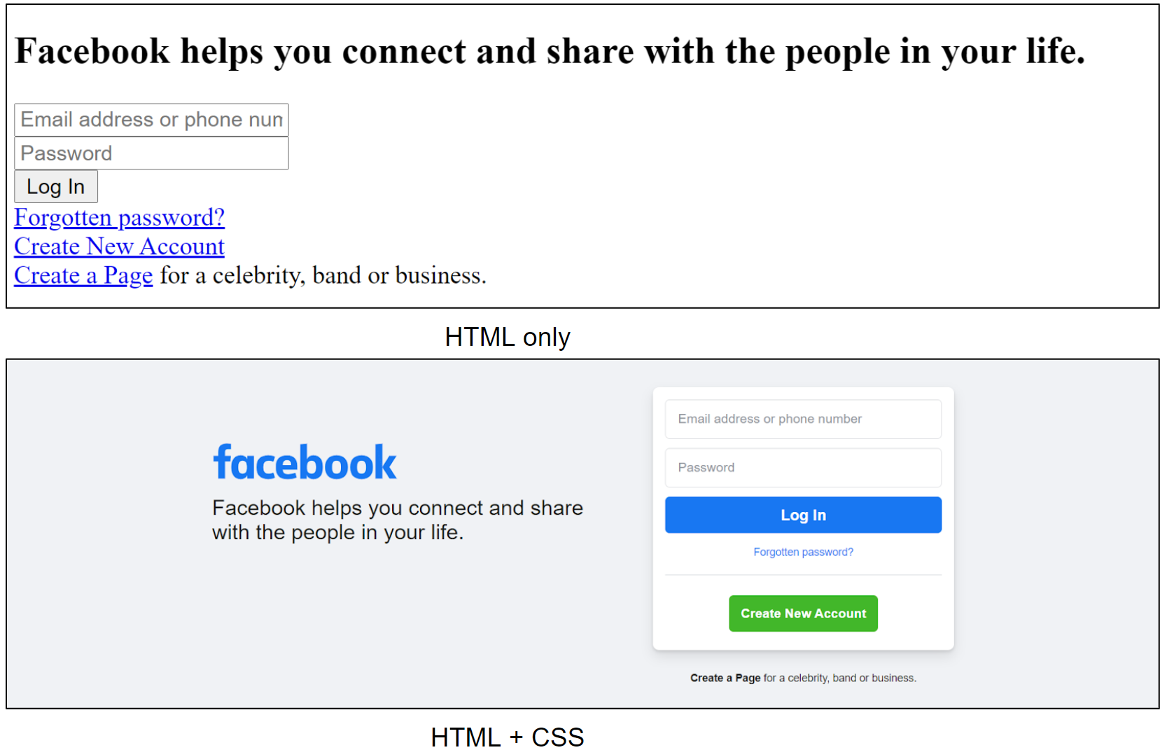
The below images show how:
-
HTML is used to define the structure of a web page
-
CSS is used to add style to it
Primary goals
-
Get started using HTML for web pages
-
Get started using CSS to style web pages
-
Get introduced to CSS Flexbox
-
Create your first static website
Objective
Get started with HTML and CSS
Background
Frontend development involves creating delightful user interfaces and experiences.
HTML and CSS are the building blocks used to create web pages. HTML defines the page structure while CSS defines the style in which it should be rendered.
Several frameworks like Bootstrap and Flexbox ease the process of creating web pages by providing standard abstractions on top of HTML and CSS.
Web browsers like Chrome, Internet Explorer, Firefox and Safari decode HTML/CSS and render web pages as created by frontend web developers and designers.
The below images show how:
-
HTML is used to define the structure of a web page
-
CSS is used to add style to it
Primary goals
-
Get started using HTML for web pages
-
Get started using CSS to style web pages
-
Get introduced to CSS Flexbox
-
Create your first static website
Using Crio Workspace
Please jump to the "Using Gitpod" section below if you’re using gitpod instead of the Crio Workspace.
Download project files
- Create
~/workspace/bytes/directory andcdto it
mkdir -p ~/workspace/bytes/

cd ~/workspace/bytes/
- Download the source code to the
~/workspace/bytes/directory using one of the following commands:
git clone https://gitlab.crio.do/crio_bytes/me_html_css.git

git clone git@gitlab.crio.do:crio_bytes/me_html_css.git
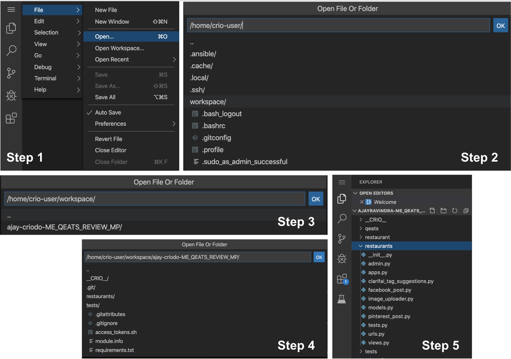
Open the source files in the IDE
-
Now that you have fetched all the required source files, you can open them in the online IDE by following these steps: Click on the
Open Folderbutton. -
Select the following folder
/home/crio-user/workspace/bytes/me_html_cssand Click onOK. Please note that the image above for illustration purposes only. The actual Byte name and the corresponding folder names might be different.
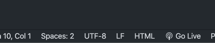
Opening Live Server
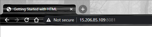
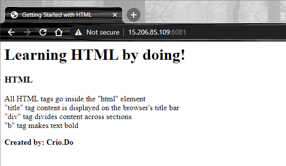
Open the index.html file at /home/crio-user/workspace/bytes/me_html_css in VSCode and click the "Go Live" button at the bottom of the screen.
-
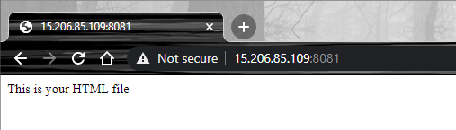
You’ll see the "Go Live" option change to “Port: 8081”. This means - visit
<your-workspace-ip>:8081to view the content of the index.html file rendered. -
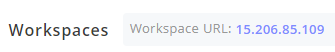
You can find your workspace IP address on top of the workspace window (your workspace IP will be different from the one in the image shown below)
* Open a new tab and visit `<your-workspace-ip>:8081` to see the content in **index.html** rendered.
The Live Server extension allows you to dynamically see the changes to your webpage, without having to refresh the page every time.
Now, let the new browser tab and Live Server keep running in the background.
Note
Until you complete adding the correct HTML structure in the next milestone, refresh the browser tab if it doesn’t automatically
Using Gitpod
Refer to this section if you’re using gitpod instead of the Crio Workspace.
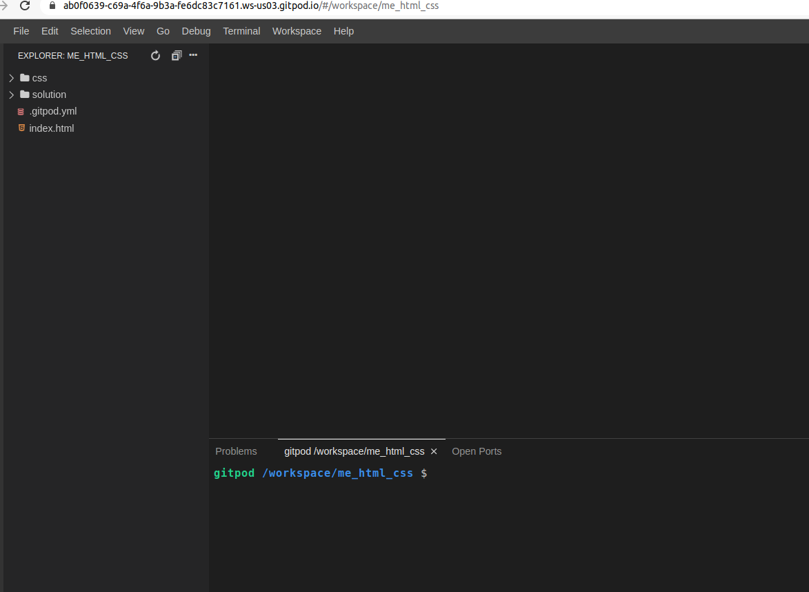
The files should already be available, like this, when you open GitPod from the Byte.
Opening Live Server
Open the index.html file at /workspace/me_html_css/ in VSCode and click the "Go Live" button at the bottom of the screen.

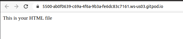
- You’ll see the "Go Live" option change to “Port: 5500” (default port) and this pop up
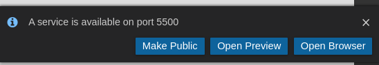
-
Click on "Make Public" to make the port accessible from your browser.
-
Go the "Open Ports" section as shown below and click on “Open Browser”
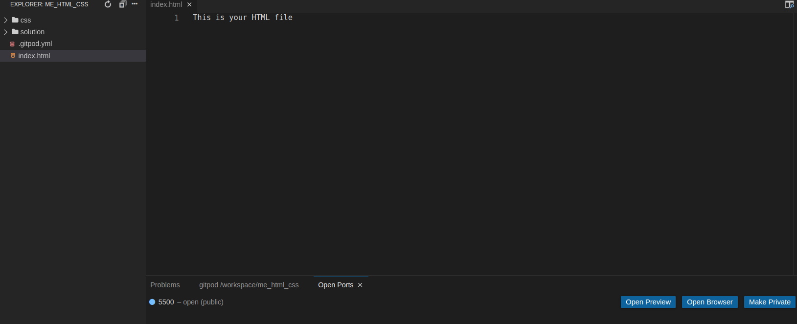
- The webpage will automatically get opened on your default browser and you’ll see the contents of your index.html file rendered like this.
The Live Server extension allows you to dynamically see the changes to your webpage, without having to refresh the page every time.
Now, let the new browser tab and Live Server keep running in the background.
Note
Until you complete adding the correct HTML structure in the next milestone, refresh the browser tab if it doesn’t automatically
HTML
An HTML file is a collection of HTML elements. An element can have
-
Opening tag of format -
<tag-type> -
Content can be text or other HTML elements
-
Closing tag of format -
</tag-type>
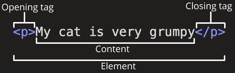
HTML Element (Source: developer.mozilla.org)
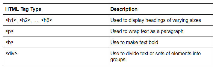
Let’s look at some of the important and commonly used HTML tag types.
<html>
All of the elements inside an HTML file should be the content of the element with tag type <html> i.e., <html> element is the parent element of all other elements.
Note
We’ll be using the tag type of the HTML element to refer to the element. For example, the element in the above picture will be referred to as a <p> tag element or just a <p> element.
<head>
Contains elements to specify metadata of the HTML document like
-
Text to be shown on the browser’s title bar
-
Dependencies like the CSS / Javascript files of the HTML document
-
Information like description of the webpage content and keywords to help search engines (e.g: Google) do a better job
<title>
Content inside the <title> tag is displayed on your browser’s title bar.
TODO - Adding title to your webpage
-
Empty your index.html file
-
Create an element with the
<html>tag in the index.html file - your first HTML element! -
Create an element with
<head>tag inside the<html>element -
Create an element with
<title>tag inside the<head>element -
Add the content of the
<title>element as - Getting Started with HTML -
What change did these make to the webpage?
You’ll find the title of the web page changed from "
This is how you would have done it
<!-- Parent tag of all other tags -->

<html>

  <!-- Contains tags to set metadata for the HTML document -->

  <head>

    <!-- Set text to be shown on the browser's title bar -->

    <title>Getting Started with HTML</title>

  </head>

</html>
Tip
To skip the browser from rendering any content in the index.html file, we can comment it out. Comments start with <!-- and ends with --> in HTML
<body>
Any content to be displayed on the web page goes inside the <body> element. Let’s check on some commonly used tags that go as content under the <body> element.
 TODO - Adding web page content
-
Create a
<body>element inside the<html>element but outside the<head>element. Rest of the elements below should go inside the<body>element. -
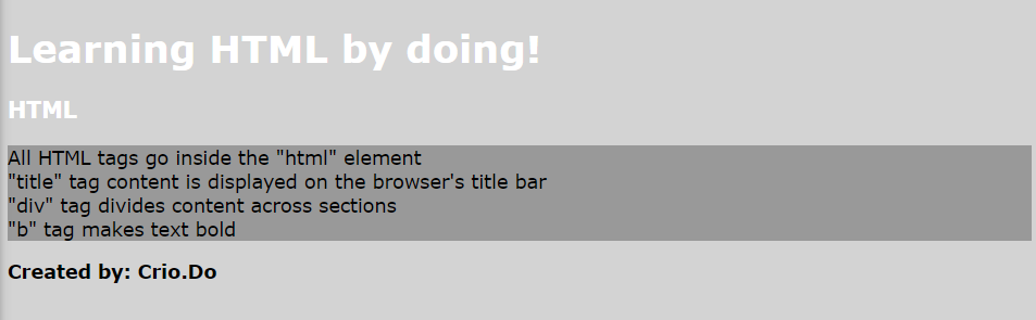
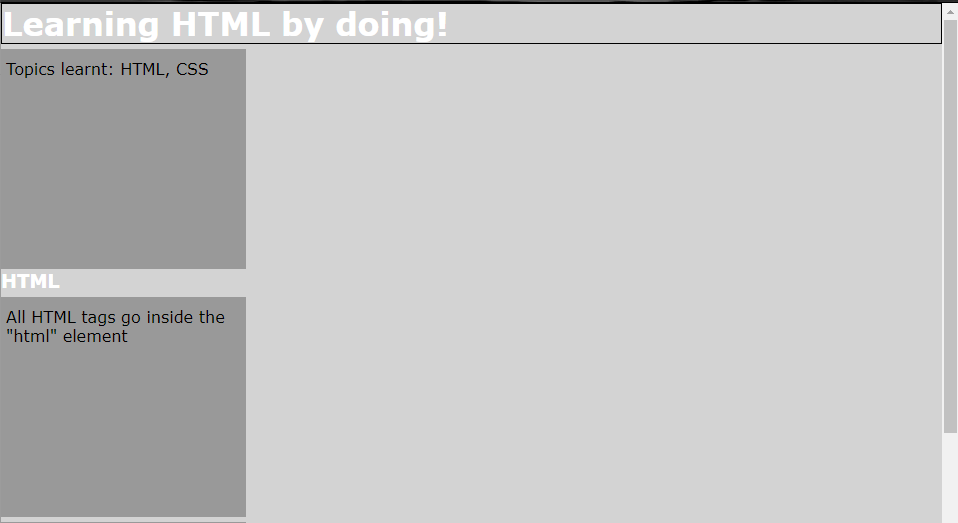
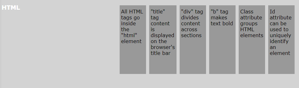
Create an
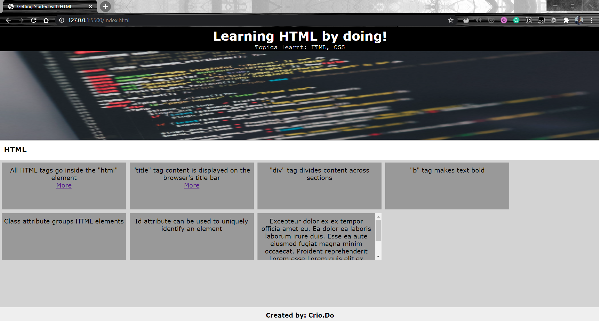
<h1>element with content - Learning HTML by doing! -
Create an
<h3>element with content - HTML -
Create four
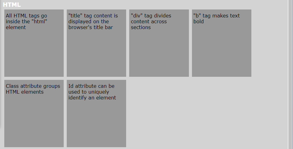
<div>elements each with content having some HTML facts you learnt till now. Eg: A particular tag’s function, HTML comments -
Create a
<p>element with text - Created by: <your-name-here>
<!-- Parent tag of all other tags -->
<html>
<!-- Contains tags to set metadata for the HTML document -->
<head>
<!-- Set text to be shown on the browser's title bar -->
<title>Getting Started with HTML</title>
</head>
<!-- Contains tags to set content of the HTML document -->
<body>
<!-- Set a header using h1 tag -->
<h1>Learning HTML by doing!</h1>
<h3>HTML</h3>
<!-- div tag divides content across sections -->
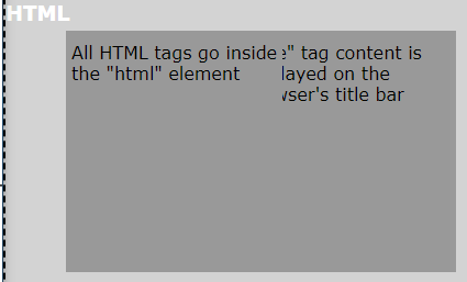
<div>All HTML tags go inside the "html" element</div>
<div>"title" tag content is displayed on the browser's title bar</div>
<div>"div" tag divides content across sections</div>
<div>"b" tag makes text bold</div>
<!-- p tag's used to wrap text -->
<!-- b tag makes the text it wrap, bold -->
<p><b>Created by: Crio.Do</b></p>
</body>
</html>
Tip
Hover over an HTML tag in VSCode to see its description
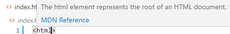
HTML Attributes
HTML attributes specify additional info about the tags. These are name-value pairs and are always added in the opening tag.
For example, value of a title attribute will be displayed when the mouse is hovered over the element
<h3 title="This is the section title">HTML</h3>
Best Practices
The HTML file should make it easier for the browser to understand that the content is of the HTML format. This can be done using the <!DOCTYPE> declaration at the very beginning of the file before the <html> element. HTML5 is the most recent version of HTML and can be specified using
<!DOCTYPE html>
The HTML hierarchy we discussed, for example, <html> being the root element, <title> going inside <head> element are specifications to be followed to avoid any inconsistent behaviour. This doesn’t mean that they won't work otherwise.
TODO -
-
Comment out or delete the
<title>element inside<head> -
Add a new
<title>element inside the<body>element -
Does the browser’s title bar display the content of the
<title>element?
You might have found that the browser renders the title even though the <title> element wasn’t inside <head>. But, this is not according to the HTML specifications and hence may or may not work in some other browser or even in future releases of the current browser
Find the HTML checkpoint code here. You’ll find similar links at the end of each milestone to compare your project files with the solution files. (Solution contains one way to perform the given tasks, there’s always different ways to do any task :) )
Common HTML Tags
Here are some more, commonly used HTML tags
-
<a>- for hyperlinks - Reference -
<img>- include image - Reference -
<ul>/ol/li- unordered and ordered list - Reference -
<strong>- bolding text - Reference -
<em>- emphasizing text - Reference -
<table>/<thead>/<tbody>/<tr>/<th>/<td>- add tables - Reference -
<form>/<input>/<label>- add forms and input fields - Reference -
<button>- add a button that users can click - Reference -
<select>/<option>- create a dropdown list - Reference
Curious Cats
-
How would you display an icon/logo in addition to text on the title bar of your web page?
-
Did you notice quotes ("") were used to refer to the tags instead of
<>in the<div>content? Try adding the tags itself to see what happens. How would you display<and>characters in plain text?
CSS
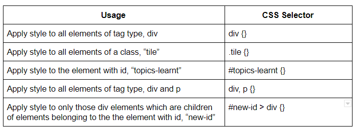
CSS is used to style your HTML document. There are three ways we can add CSS to a HTML document.
- External -
-
use
<link>tag to link a CSS file to the HTML document -
helps to apply styles to multiple HTML documents
- Internal -
-
use
<style>tags to write CSS directly in the HTML document -
helps to apply styles for a specific HTML document, this cannot be shared.
- Inline -
-
use the style HTML attribute to add style directly to a tag in the HTML document
-
helps to directly add styles to the corresponding HTML element but can become hard to maintain. Also, it becomes tedious if required to add styles for large number of elements.
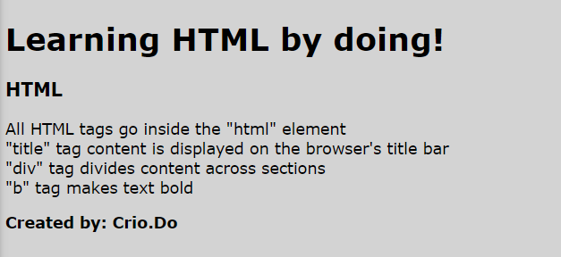
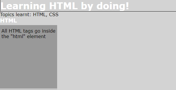
TODO - Change background color and font for contents of <body> (Reference)
-
Internal - use
<style>tag to set styles -
Do you see the screen background turn grey and the font change?
-
Inline - remove the
<style>tag, use style attribute to set the styles -
External - remove the inline styles, link the index.html file to pick up styles from the css/styles.css file
For the external linking, you inserted this tag inside the <head> element, right?
<link rel="stylesheet" href="css/styles.css" />
-
<link>tag links the HTML document to external resources like CSS, Javascript -
relandhrefare HTML attributes -
rel="stylesheet”tells that the resource linked is a CSS file -
href="css/styles.css”sets the location of the CSS file to be linked relative to the HTML document
But how did the background color and the font change?
Take a look at the contents of the css/styles.css file. You’ll see this CSS style rule
body {

    font-family: Verdana;

    background-color: lightgrey;

}
-
Properties for the
<body>element is set by specifying the tag type and enclosing in braces.bodyis called the CSS selector which selects the<body>tag -
font-familyis a CSS property and sets the font to be used -
background-coloris a CSS property and sets the background color -
Setting a property to the
<body>element will set it for all its child elements as well. This is the "cascade" in CSS (Cascading Style Sheet). Unless the child elements have a different style specified, the style from the parent will be cascaded. Cascade decides the order in which the rules are applied to the HTML elements.
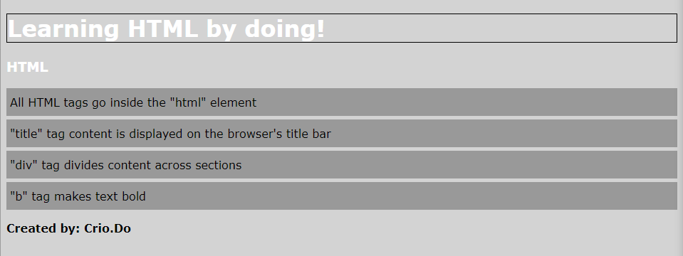
TODO -
-
Add background color, #999999 (color represented as hex value) to all the
<div>elements. (Reference) -
Set the text color for the
<h1>and<h3>elements to white. (Reference)
Your web page should look like this now
The CSS file will need these entries
/* CSS selector to set style for the <body> element */

body {

  /* Set the font of text displayed */

  font-family: Verdana;

  /* Set the background color */

  background-color: lightgrey;

}


h1 {

  /* Set text color */

  color: white;

}


h3 {

  color: white;

}


div {

  background-color: #999999;

}
Note
If you find an empty box with the same background color as that of the <div> element after the "Created by: Crio.Do" text, don’t freak out!
It’s the live server appending HTML of its own for auto-rendering purposes. You won’t see this if you directly open the index.html file.
CSS Box Model
Each of the HTML elements are basically a rectangular region and these properties are used to manage this region
-
margin- is the distance to keep from the neighboring elements -
border- is the border for the HTML element’s region -
padding- is the space, content of the element likes to keep from its border -
heightandwidth- specifies the height and width of the content area
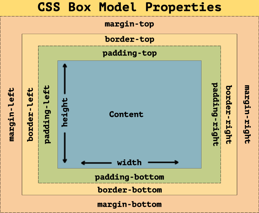
CSS Box Model (Source: teachable.com)
Try out this CSS Box Model playground to better understand the properties - Playground
TODO -
-
Set solid black border of 1px width for the
<h1>tag on all sides (Reference) -
The
<div>elements are all touching each other. Add space between the<div>tags by setting a margin. Use these values (Reference)
margin-top - 5px

margin-right - 0px

margin-bottom - 0px

margin-left - 0px
- The text in the
<div>tags seem to be too close to the borders. Add space between the border and the text content i.e, padding of 10px (on top and bottom), 5px (on right and left).
Your CSS file should be similar to this right now with the new additions
body {

  font-family: Verdana;

  background-color: lightgrey;

}


h1 {

  border: 1px solid black;

  color: white;

}


h3 {

  color: white;

}


div {

  background-color: #999999;

  margin: 5px 0px 0px 0px;

  padding: 10px 5px;

}
-
border: 1px solid black;sets a black solid border of 1px thickness -
margin: 5px 0px 0px 0px;sets 5px margin on top and 0px on all other sides. The order of the sides are (top, right, bottom, left) -
padding: 10px 5px;is a shorthand forpadding: 10px 5px 10px 5px(top, right, bottom, left). If the bottom value isn’t provided, it’s taken as same as that of the top. Similarly, left defaults to the value given for right if not provided.
TODO -
-
Set the default margin and padding for any element to be 0px on all sides (Reference)
-
Set the width of the content area for the
<div>tags to be 25% of the screen width and height to 200px (Reference)
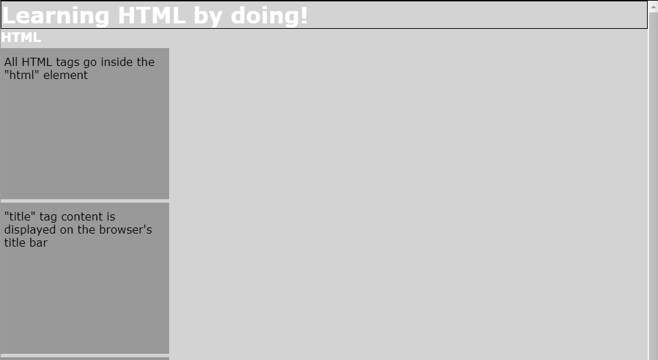
Contents of the CSS file as of now would be
* {

  margin: 0px;

  padding: 0px;

}


body {...} /* No change in rules from earlier */

h1 {...}

h3 {...}


div {

  background-color: #999999;

  margin: 5px 0px 0px 0px;

  padding: 10px 5px;

  height: 200px;

  width: 25%;

}
-
heightsets the height of the content area to be 200px even if there isn’t text to fill the whole height -
widthsets the width to 25% of the width provided by the parent element of<div>tags which here is the<body>element. This is the same as the total width of the screen as we haven’t set margin/border/padding for<body>
The px value you set doesn’t correlate to your device’s pixel but rather is a CSS unit. The % value sets the length relative to the element’s parent. For example, if an element’s parent is of width 100px and you set the width of the child element to 50%, the result width in pixels should be 50px. (See more units here)
The total width of the <div> elements is calculated by
Total width of element = width + padding-left + padding-right + border-left + border-right + margin-left + margin-right
If 25% of the screen resolves to 120px, the total width of the element in this case would be
Total width of element = 120px + 5px + 5px + 0px + 0px + 0px + 0px = 130px
So, even if the width property is set to 25%, the total width of the element can be greater.
The Chrome Dev tools make it easier to visualize these values. See here to find out how. (Ensure browser zoom is at 100% for correct values)
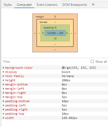
Chrome Developer Tools (values for one of the <div> element)
Did you notice the <div> elements didn’t get aligned in a single line even when the width was only 25%?
The secret lies in the display type of the <div> element. See here and play around with different display types for the <div> element.
Here’s the checkpoint code
Grouping HTML Elements
Now that you’ve learned a thing or two about CSS, let’s put them into practice.
TODO -
-
Add a section for CSS like that for HTML and add 4 CSS facts you picked up
-
Ensure the new tags are after the last
<div>tag of HTML facts and before the<p>tag
Sample html to add
<h3>CSS</h3>


<div>CSS adds style to the HTML document</div>

<div>"link" tag can be used to set the CSS file to be used</div>

<div>Child elements inherit styles from its parent</div>

<div>Different metrics like px, %, pt can be used to specify length</div>
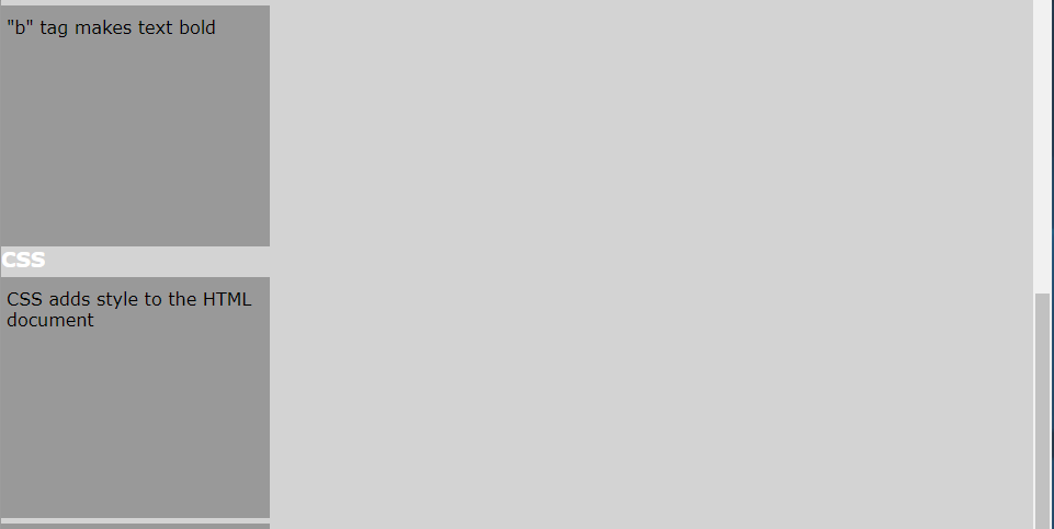
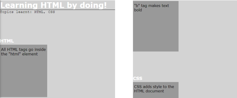
TODO - Add the below <div> tag after the current <h1> tag
<div>Topics learnt: HTML, CSS</div>
Hmm, the new <div> also gets styled into a grey box as we have a CSS rule set for any <div> tag. How would you set CSS style for all your <div> tags other than the "Topics learnt" one?
HTML provides a class attribute to group elements. The class name can be used to apply a particular style to all the elements in that class.
TODO -
-
Add a class attribute with value tile to all the
<div>elements apart from the "Topics learnt" element (Reference) -
Replace the current CSS rule set for
<div>elements to that for elements of the class tile by changing the CSS selector
You’ll see the styles not applied to the "Topics learnt" div if you did this correctly
You will have changed the selector from div to .tile to do this. The period (.) character tells that the selector is for an HTML class.
<!-- to add class to each of the HTML/CSS fact divs -->

<div class="tile">All HTML tags go inside the "html" element</div>

<div class="tile">"title" tag content is displayed on the browser's title bar</div>
// to replace div selector with .tile in css/styles.css

.tile {

  background-color: #999999;

  margin: 5px 0px 5px 0px;

  padding: 10px 5px;

  height: 200px;

  width: 20%;

}
Now, how would you set a CSS style for just the "Topics learnt" <div> element?
The HTML id attribute can be used to uniquely specify an HTML element.
TODO - Set the font of just the "Topics learnt" <div> element to "Courier New"
The id attribute specifies id for an element
<div id="topics-learnt">Topics learnt: HTML, CSS</div>
You will have had to add a new rule like this
#topics-learnt {

  font-family: "Courier New";

}
The id names are preceded by the # character to use it as a CSS selector.
What happens if there’s a conflicting rule for an element, i.e., the background is set to red using the element’s tag, set to gray using the element’s class and set to blue using the element’s id?
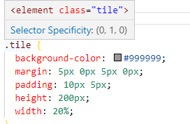
TODO - Finding selector specificity
-
Add an id attribute, tile1 to the first
<div>tag in the HTML facts section (which also belongs to the tile class) -
Add a CSS rule using the tag type (
<div>) to set the background color to red -
Add a CSS rule using the id value to set the background color to blue
-
Which of these are of higher priority ie, what color does the background display?
/* This rule is already present */

.tile {

  background-color: #999999;

  margin: 5px 0px 5px 0px;

  padding: 10px 5px;

  height: 200px;

  width: 20%;

}


div {

  background-color: red;

}

#tile1 {

  background-color: blue;

}
You’d have found that the background color set by id attribute gets displayed for the element you set an id of tile1 meaning that it’s of the highest priority among these.
VS Code also helps by displaying the selector specificity of a rule which can be used to determine the priority. Hover over the selector name to see it. Here, the rule has a specificity of (0, 1, 0). Check the same for the other two rules.
Priority of rule with selector specificity: (1, 0, 0) > (0, 1, 0) > (0, 0, 1)
Note: Remove the extra CSS rules added in the previous TODO (div and #tile1 selectors)
Let’s separate the HTML and CSS sections.
TODO -
-
Wrap the complete HTML facts section (
<h3>and the<div>s) in a<div>element -
Set the
classattribute for the new parent<div>element to container -
Do the same for the CSS section
-
For each of these new
<div>s belonging to the container class-
Add 100px padding on top
-
Add 10px margin on bottom
-
Space between title and HTML section (left), space between HTML and CSS sections (right)
To summarise,
-
class is useful to identify a group of same or different tag types easily and apply CSS styling for the entire group elements
- Multiple elements can have the same class names. Eg: all the elements below belong to the class, "tile"
<div class="tile" id="tile1">All HTML tags go inside the "html" element</div>

<div class="tile">"div" tag divides content across sections</div>

<div class="tile">"b" tag makes text bold</div>
* A single element can belong to multiple classes. Distinct classes are space-separated in a single "class" HTML attribute like below
<div class="tile last-card">"b" tag makes text bold</div>
-
id is useful to identify a specific element and to apply CSS styles for a single element
- id names across the HTML document should be unique and shouldn’t repeat. Eg: Below scenario shouldn’t happen
<h1 id="topics-learnt">Learning HTML by doing!</h1>

<h1 id="topics-learnt">Happy Learning!</h1>

<div id="topics-learnt">Topics learnt: HTML, CSS</div>
* An element should contain only a single id. Eg: Below scenario shouldn’t happen
<div id="topics-learnt div-element">Topics learnt: HTML, CSS</div>
- An element can have both id and class properties
<div class="tile" id="tile1">All HTML tags go inside the "html" element</div>
Here’s the checkpoint code
CSS Flexbox
CSS Flexbox is used to automatically arrange HTML elements according to the screen size i.e, the page will look clean viewed on a laptop or on mobile. Flexbox works by setting an HTML element as a flex container and positions the child elements within the flex container element.
Use this Flexbox playground to help your way through the TODOs
TODO - To add CSS styles in the css/styles.css file
-
Set the width of the
<h3>headers to 100% -
Set 5px margin on all sides for tile class elements -
margin: 5px; -
Add a couple more facts like the ones given below (
<div>tags) to HTML section at the bottom (inside the first<div>with container class)
<div class="tile">Class attribute groups HTML elements</div>

<div class="tile">Id attribute can be used to uniquely identify an element</div>
- Set the
<div>elements of class container as the flex container using thedisplayproperty
h3 {

  color: white;

  width: 100%; // newly added according to the above TODO

}

.tile {

  background-color: #999999;

  margin: 5px; // newly added according to the above TODO

  padding: 10px 5px;

  height: 200px;

  width: 20%;

}


.container {

  padding: 100px 0px 0px 0px;

  margin-bottom: 10px;

  display: flex;  // newly added according to the above TODO

}


// not all CSS rules in css/styles.css is shown here
Setting the display property to flex for the elements belonging to the class, container, sets them as flex containers.Now, additional flexbox properties can be used to arrange the child elements of flex containers.
You’ll see all six tiles arranged in the same row. The horizontal axis is the main axis of the flex container by default which makes the vertical axis, the cross axis. Try using the flex-direction property to change the main axis of the flex container.
But each of the <div> tags in the tile class have a width of 20%, so shouldn’t five of them come in a row and one in the next?
The default behaviour of the flex container is to set all its elements in a single-line and adjust the width of its child elements for doing this.
TODO -
-
Use the
flex-wrapproperty on the flex container to split the elements into multiple lines when required -
Try changing the size of the browser tab to see the elements gets automatically resized (To do this easily - press ‘CTRL + SHIFT + I’ and then resize the browser window width by changing the width of the new window that opened)
.container {

  padding: 100px 0px 0px 0px;

  margin-bottom: 10px;

  display: flex;

  flex-wrap: wrap;

}
But, shouldn’t it have been 5 in the first row and 1 in the next as each of the elements is of 20% width?
If you check, the space left on the first row isn’t enough for another tile meaning less than 20% of width is remaining once the four tiles are arranged. As we discussed earlier, the total width of the elements includes the margin/border/padding apart from the width set. Thus, the resultant width of each of the elements will be greater than 20%.
The justify-content property of the flex container can be used to change how the elements are aligned across the main axis (horizontal axis here).
TODO - Try out different values for the justify-content property like space-evenly, center
The align-items property is used to align the elements across the cross axis (vertical axis here).
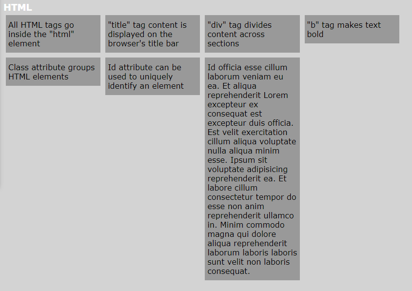
TODO - Add a new <div> tag in the HTML section with class tile and content below. Does anything peculiar happen?
Id officia esse cillum laborum veniam eu ea. Et aliqua reprehenderit Lorem excepteur ex consequat est excepteur duis officia. Est velit exercitation cillum aliqua voluptate nulla aliqua minim esse. Ipsum sit voluptate adipisicing reprehenderit ea. Et labore cillum consectetur tempor do esse non anim reprehenderit ullamco in. Minim commodo magna qui dolore aliqua reprehenderit laborum laboris laboris sunt velit non laboris consequat.
-
Comment out the
heightproperty set for elements of class tile. What happens now? -
Change
align-itemsproperty so that each tile element is of the exact size required to hold each of their text content as below - nothing more nothing less.
-
You’ll see that the large text overflows past the element when a fixed height is set
-
When height isn’t set, the element expands its height to hold the large piece of text completely.
-
As the default value for
align-itemsis stretch, height of other elements in the same row (main axis) will also be matched
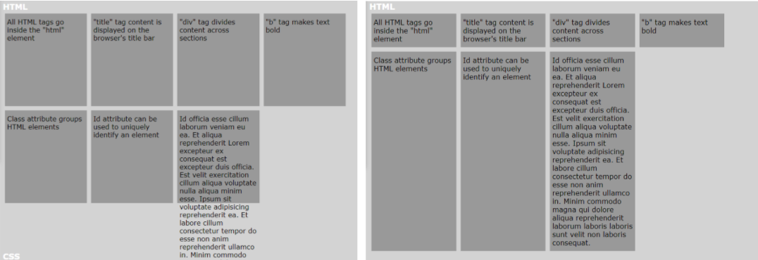
Fixed height (left), No height property set (right)
- Setting
align-items: flex-start;sets the height of the containers based on their text content
Here’s the checkpoint code
Note
-
Uncomment the
heightproperty for tile class -height: 200px; -
Comment out the
justify-contentoralign-itemsproperty if set
Positioning in CSS
The CSS position property can be used to modify the position of an HTML element. The top/bottom/left/right properties set the distance of the element from each of the four sides of the viewport or it’s parent element or it’s current position based on its position property.
TODO -
-
Add border to the container class -
border: 2px dashed black; -
Move the
<div>tag with id, tile1 to the top-right corner of the viewport (screen)
- Change the position of the same
<div>tag to 50px to the right of its original position
You can do these by
- Below style, sets the card at the top-right corner.
position: absolutemeasures distance from the viewport (screen). 0px from the top edge of the screen and 0px from the right edge of the screen puts the element at the top-right corner of the screen. Try it out!
#tile1 {

  position: absolute;

  top: 0px;

  right: 0px;

}
- Using
position: relative;we can move the element with respect to its current position. Setting a distance of 50px from the left edge means moving right by 50px. Try it out by updating the CSS rule for #tile1 to below rule.
#tile1 {

  position: relative;

  left: 50px;

}
Remove or comment out the #tile1 rules added above and remove the border in the container class rule
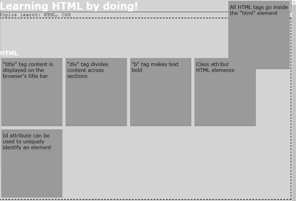
TODO - Use positioning properties to make the <h1> and "Topics learnt" <div> fixed to the top of the viewport when the page is scrolled.
The position: fixed property can be used to fix an element to a particular position on the view port which doesn’t change on scrolling. As both of them need to be fixed to the top, better group them as a <div> and set the position property for this parent <div> element.
<div id="title">

  <h1>Learning HTML by doing!</h1>

  <div id="topics-learnt">Topics learnt: HTML, CSS</div>

</div>
/* File: Styles.css */

#title {

  position: fixed;

  width: 100%;

  /* color: white;

  background-color: black; */

}
Here’s the checkpoint code
Build it!
How about you do the finishing touches to make your webpage look like the below template?
Requirements are:
-
The heading (Tip: Use a
<div>tag to group the elements)-
Has to be in black background with white text
-
Text is centre aligned
-
Set height appropriately
-
-
Add a banner image
-
HTML subheading
- Set height and padding appropriately
-
HTML facts cards
-
Add links to the text
-
When hovered over, the link color should turn red
-
Should be able to view larger pieces of text by scrolling
-
Modify height appropriately
-
-
Footer ("Created by Crio.Do") tag
- As in template
Here’s the checkpoint code
Curious Cats
- You’ll find the HTML "role" attribute used commonly in snippets found online. Check out what it does. Need to understand it better? Add a role attribute to one of your elements and use the ChromeVox screen-reader extension to read out its content by clicking on it. See the difference (“hear” to be precise :) ) with and without the “role” attribute.
Summary
-
HTML is used to describe the contents of your webpage
-
All HTML content goes inside the
<html>tag -
HTML document’s metadata goes inside the
<head>tag and all the content to be displayed inside the<body>tag -
There are different HTML tags to perform different actions
-
<b>- bolds text -
<p>- wraps text as a paragraph -
<a>- add hyperlink
-
-
CSS makes the HTML content look beautiful
-
CSS can be added to the HTML
-
Externally - linking css files
-
Internally - using
<style>tag -
Inline - using style attribute
-
-
CSS flexbox makes it easier to organize a group of elements
-
CSS positioning can be used to set the position of an HTML element in the web page. For example, you can fix an element to the top of the web page even when scrolling.
-
Further reading
-
Find solutions to the Curious Cats questions here
Newfound Superpowers
- Knowledge of frontend languages HTML and CSS
Now you can
-
Build a static webpage using HTML and CSS
-
Use CSS flexbox to organize content based on the display screen size