Get started with the Bootstrap framework
Objective
Prerequisite
The HTML-CSS Byte is a prerequisite and the current Byte assumes knowledge of topics covered there - basics of HTML, CSS, and Flexbox.
Background
Writing CSS from scratch takes time. Bootstrap can be your go-to choice if you need to quickly create a good enough frontend to which you don’t plan on adding too many customizations.
Important advantage of using Bootstrap in your websites is that it’s easy to make the website responsive i.e., your website will look clean on varying screen sizes.
Primary goals
-
Learn to use Bootstrap framework in your projects
-
Use Bootstrap to build a responsive navigation bar
-
Use Bootstrap to build a responsive content grid
Objective
Get started with the Bootstrap framework
Prerequisite
The HTML-CSS Byte is a prerequisite and the current Byte assumes knowledge of topics covered there - basics of HTML, CSS, and Flexbox.
Background
Writing CSS from scratch takes time. Bootstrap can be your go-to choice if you need to quickly create a good enough frontend to which you don’t plan on adding too many customizations.
Important advantage of using Bootstrap in your websites is that it’s easy to make the website responsive i.e., your website will look clean on varying screen sizes.
Primary goals
-
Learn to use Bootstrap framework in your projects
-
Use Bootstrap to build a responsive navigation bar
-
Use Bootstrap to build a responsive content grid
Download project files
- Create
~/workspace/bytes/directory andcdto it
mkdir -p ~/workspace/bytes/

cd ~/workspace/bytes/
- Download the source code to the
~/workspace/bytes/directory using one of the following commands:
git clone https://gitlab.crio.do/crio_bytes/me_bootstrap.git

git clone git@gitlab.crio.do:crio_bytes/me_bootstrap.git
Open the source files in the IDE
-
Now that you have fetched all the required source files, you can open them in the online IDE by following these steps: Click on the
Open Folderbutton. -
Select the following folder
/home/crio-user/workspace/bytes/me_bootstrapand Click onOK.
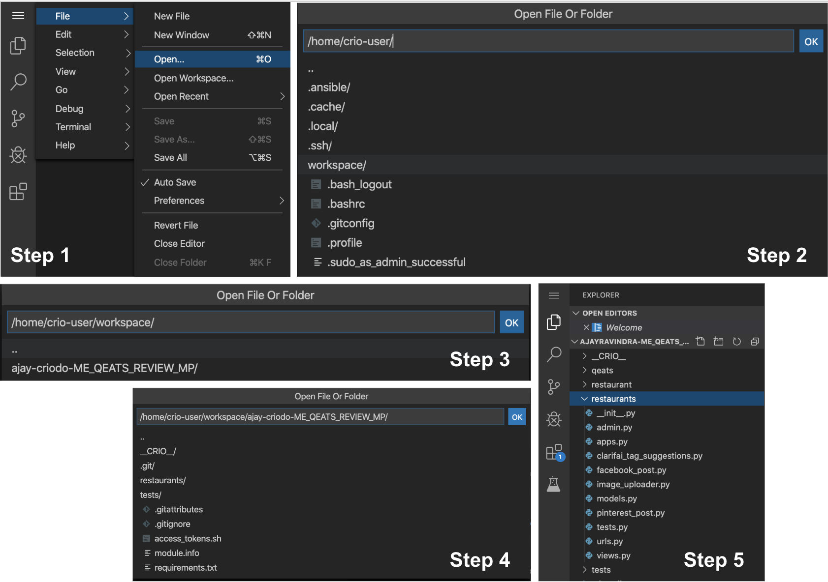
Note
Please use the image above for illustration purposes only. The actual Byte name and the corresponding folder names might be different.
Developer Environment Setup
1.Live Server
The Live Server extension allows you to dynamically see the changes to your webpage, without having to refresh the page every time.
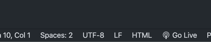
Open the index.html file at /home/crio-user/workspace/bytes/me_bootstrap in VSCode and click the "Go Live" button at the bottom of the screen.
-
If you are using your local machine, you’ll see the "Go Live" option change to “Port: 5500” (default port) and the webpage will automatically get opened on your default browser with the URL -
localhost:5500. You’ll see the contents of your index.html file rendered. -
If you are on Crio workspace,
-
you’ll see the "Go Live" option change to “Port: 8081”. This means - visit
<your-workspace-ip>:8081to view the content of the index.html file rendered. -
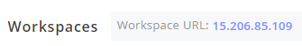
You can find your workspace IP address on top of the workspace window (your workspace IP will be different from the one in the image shown below)
-
* Open a new tab and visit `<your-workspace-ip>:8081` to see the content in **index.html** rendered.
Now, let the new browser tab and Live Server keep running in the background. Your web page content will be automatically updated every time you make a change.
2.Prettier code formatting
Use the "Shift + Alt + f" shortcut inside index.html to auto-format your HTML code using the Prettier VS code extension.
If you get a pop-up like below, click on "Configure…" and select “Prettier - Code Formatter) from the dropdown menu.
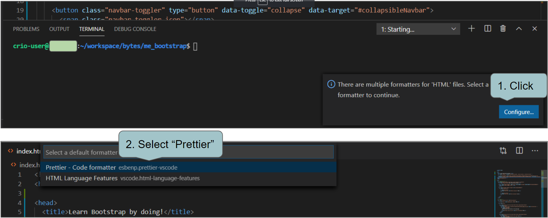
Note
Prettier will fail to format your code if there’s some syntax error like missing a closing tag.
Using plain CSS to style your elements
How exactly does Bootstrap speed up frontend development? Let’s see.
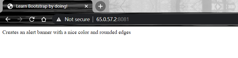
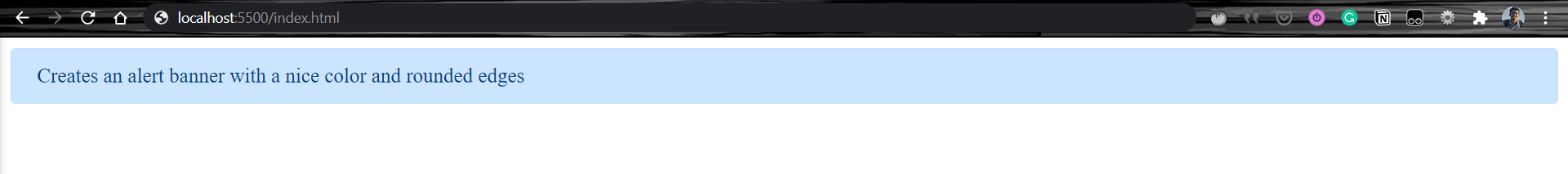
Can you give a shot at styling the <div> element given in index.html (also shown below) to look similar to the screenshot provided? (Add CSS to the css/styles.css file)
<div class="alert alert-primary">

    Creates an alert banner with a nice color and rounded edges

</div>
Some properties that you need to implement:
-
The edges are to be round
-
Give padding and margin appropriately
-
Use #004085 as text color and #cce5ff as background color
Were you able to do it? How much time did it take?
TODO - Copy the below CSS rules to css/styles.css file and you’ll see the <div> element styled as shown in the above screenshot
.alert {

  position: relative;

  padding: .75rem 1.25rem;

  margin-bottom: 1rem;

  border: 1px solid transparent;

  border-radius: .25rem;

}


.alert-primary {

  color: #004085;

  background-color: #cce5ff;

  border-color: #b8daff;

}
Note
Check how your web page looks after any changes you make to the project files
Adding Bootstrap to your web page
What Bootstrap does is to create CSS rules for different styles beforehand and provide their CSS file for us to use. This allows us developers to add classes exposed by Bootstrap to our HTML elements and apply the Bootstrap CSS styles to them.
In Layman’s terms, Bootstrap is just a huge CSS library with styles added to ‘classes’ and allowing us to reuse these classes.
TODO -
-
Empty your css/styles.css file (The styles will go away from your web page. Not very surprising, right?)
-
Add the below
<link>element as a child of<head>in the index.html file (Ensure this is above any other<link>elements already present).
<link

    rel="stylesheet"

    href="https://stackpath.bootstrapcdn.com/bootstrap/4.5.2/css/bootstrap.min.css"

    integrity="sha384-JcKb8q3iqJ61gNV9KGb8thSsNjpSL0n8PARn9HuZOnIxN0hoP+VmmDGMN5t9UJ0Z"

    crossorigin="anonymous"

/>
- You’ll see the
<div>element styled according to this bootstrap css now (try zooming in to view the edges rounded). What do you think happened?
By adding the <link> element provided in the above todo, your browser plugs in the Bootstrap 4 CSS file to your web page. alert and alert-primary are classes Bootstrap uses and thus your <div> element, which belongs to these classes, gets styled. Not convinced?
Let’s check out the network requests made on the web page and try to find out if there are CSS rules specified for the alert and alert-primary classes.
TODO -
-
Open the Chrome Developer Tools window by right-clicking inside your web page and clicking on Inspect (The "Ctrl + Shift + i" / “Cmd + Shift + i” shortcut would also do)
-
Access the "Networks" tab. Refresh web page to view the network requests made by your web page.
-
Click on the request for the Bootstrap CSS file to view it in detail
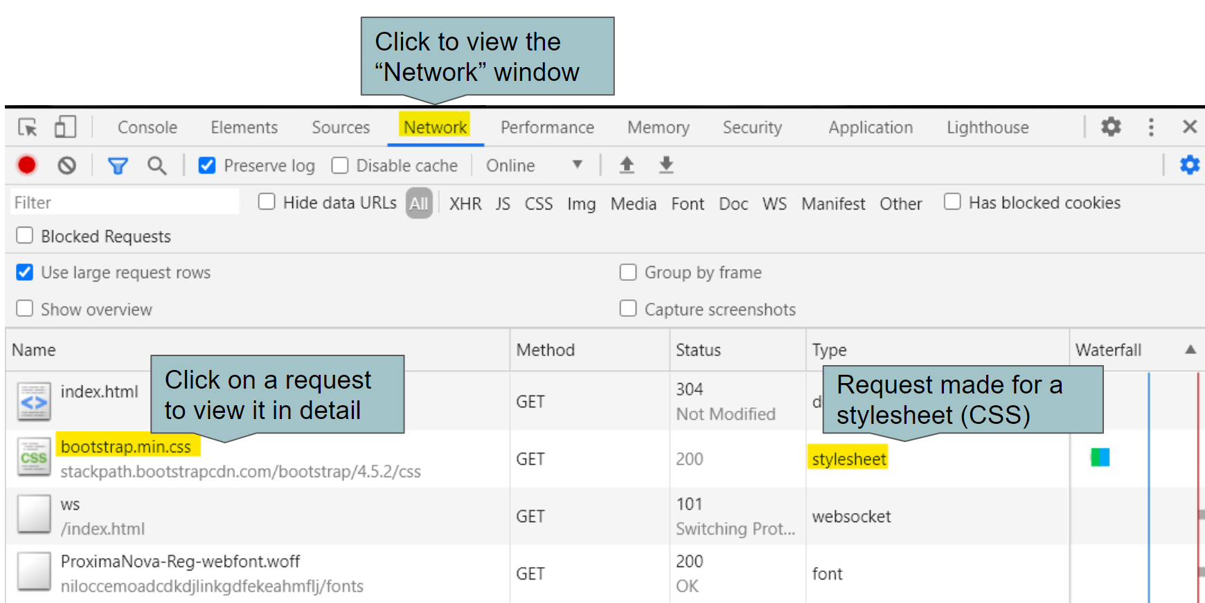
Chrome Developer Tools - Networks window
Ok, so a network request was indeed made for the Bootstrap CSS file. Now, let’s find out the style rules predefined for the alert and alert-primary classes.
TODO -
-
Clicking on the Bootstrap CSS request opens up a new window. Click on the Preview tab to view the contents of the CSS file the Bootstrap server sent.
-
Use "Ctrl + f" to search for alert and alert-primary keywords. Do you find any CSS rules? Is it similar to the one we used before, inside the css/styles.css file?
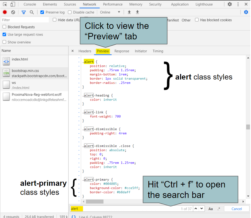
View content of Bootstrap CSS file in Developer Tools
There it is! The alert class has a border-radius property which makes the border (edge) rounded. Similarly, the alert-primary class selector has in it colors set for the text, background and the element border.
You might have noted that the reference web page image given to you at the start of the milestone had some margin on the left and right (whitespace between web page edge and the alert banner). On the other hand, the alert banner created by Bootstrap takes the full width of the web page.

CSS Version

Bootstrap Version
Bootstrap version doesn’t have a margin because the margin’s set to 0 on all sides explicitly. You’ll find this style at the starting of the Bootstrap CSS file.
body {

    margin: 0;

    font-family: -apple-system,BlinkMacSystemFont,"Segoe UI",Roboto,"Helvetica Neue",Arial,"Noto Sans",sans-serif,"Apple Color Emoji","Segoe UI Emoji","Segoe UI Symbol","Noto Color Emoji";

    font-size: 1rem;

    font-weight: 400;

    line-height: 1.5;

    color: #212529;

    text-align: left;

    background-color: #fff

}
Let’s go ahead and improve the alert banner by adding some margins. Wait! You’re not allowed to set the margin property inside the css/styles.css file :)
TODO - Wrap your <div class="alert alert-primary> element inside a new <div> element belonging to the container class like below. What happened?
<div class="container">

  <div class="alert alert-primary">

    Creates an alert banner with a nice color and rounded edges

  </div>

</div>
Adding the container class <div> adds margin and padding to the <div> element to which the class is added. Value for its margin-left and margin-right CSS properties are set to auto in the Bootstrap CSS file and thus the element will be centered.
// Snippet from the Bootstrap CSS file

.container,.container-fluid,.container-lg,.container-md,.container-sm,.container-xl {

    width: 100%;

    padding-right: 15px;

    padding-left: 15px;

    margin-right: auto;

    margin-left: auto

}

There you go. By adding just three classes (container, alert and alert-primary) to your HTML, you now have a beautiful looking alert banner to display on your web page.
Not a fan of the blue color? Rapidly switch to a different color by replacing the alert-primary class with alert-secondary, alert-success or any other options given here.
TODO -
-
Try out alternatives for the alert-primary class found here and see the text, background and border color changing
-
Need to change the text or background color separately, find classes for those here. Try those out.
We’ll see how Bootstrap allows us to add responsive elements to our web page in the coming milestones.
Your index.html file should look like this now and css/styles.css should be empty.
<!DOCTYPE html>

<html>

  <head>

    <title>Learn Bootstrap by doing!</title>

    <link

      rel="stylesheet"

      href="https://stackpath.bootstrapcdn.com/bootstrap/4.5.2/css/bootstrap.min.css"

      integrity="sha384-JcKb8q3iqJ61gNV9KGb8thSsNjpSL0n8PARn9HuZOnIxN0hoP+VmmDGMN5t9UJ0Z"

      crossorigin="anonymous"

    />

    <link rel="stylesheet" href="css/styles.css" />

  </head>

  <body>

    <div class="container">

      <div class="alert alert-primary">

        Creates an alert banner with a nice color and rounded edges

      </div>

    </div>

  </body>

</html>
Tip
You’ll find lines like this commonly in documentations related to Bootstrap, "Add the .justify-content-center class to center the navigation bar". This doesn’t mean you should set the class value as <div class=".justify-content-center"> but rather <div class="justify-content-center"> i.e., without the period (.).
Note
Going forward, you’ll find at many places referring to "reducing the web page size" or “reducing the screen size”. There, you’ll basically need to reduce the width of your browser tab in which the web page is opened. This is done to check how your web page would look when opened on devices with varying screen sizes like a desktop, tablet, smartphone etc.
Curious Cats
-
Why is it that the Bootstrap
<link>has to be added before any other stylesheets? -
What if you want to use a predefined bootstrap class, but you need an extra property over that. For eg: You want all the styles provided by
containerclass but also want a2px green solidborder over it?
Create a responsive navigation bar
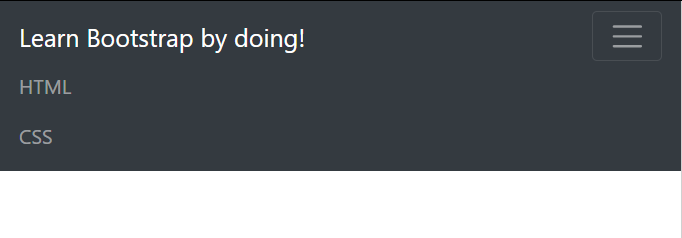
Let’s use Bootstrap to create a navigation bar whose links wrap themselves into a toggle bar on smaller devices (smaller screen size) like your smartphone. Didn’t quite get it? See the demo below.
This is how the navigation bar looks like when expanded (larger screens).
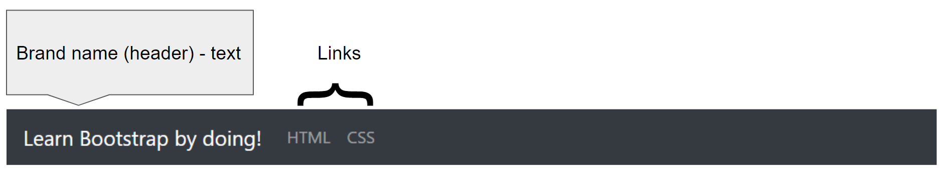
Navigation bar with brand text and two links
TODO -
-
Empty the
<body>element in index.html i.e., remove any child elements. -
Copy the below bare HTML required to create the "Learn Bootstrap by doing!" brand text and two links for the navigation bar. Paste it inside the
<body>element.
<nav >

    <div >Learn HTML by doing!</div>


    <div  id="collapsibleNavbar">

    <ul >

        <li >

        <a  href="#">HTML</a>

        </li>

        <li >

        <a  href="#">CSS</a>

        </li>

    </ul>

    </div>

</nav>
- Use this reference to add the required classes to make your navigation bar look like the one below.

- Try decreasing the size of your web page (width) by reducing your browser tab size. What happens on doing so?
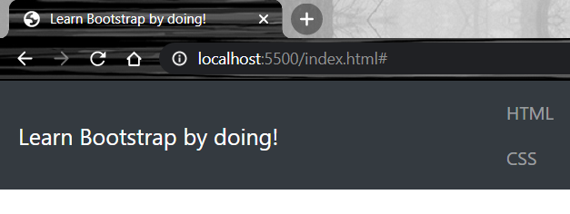
This is how you might have done this.
<nav class="navbar bg-dark navbar-dark navbar-expand-sm">

    <div class="navbar-brand">Learn Bootstrap by doing!</div>


    <div  id="collapsibleNavbar">

    <ul class="navbar-nav">

        <li class="nav-item">

        <a class="nav-link" href="#">HTML</a>

        </li>

        <li class="nav-item">

        <a class="nav-link" href="#">CSS</a>

        </li>

    </ul>

    </div>

</nav>
Let’s take a look at the Bootstrap classes of the <nav> element
-
navbar - necessary wrapper class for navigation bars
-
bg-dark - sets a dark background to the navigation bar
-
navbar-dark - sets the text and links inside the navigation bar to whitish color to suit the dark background
-
navbar-expand-sm - sets the navigation bar links to expand (show on the same line) if the screen size is atleast "small" (we’ll see what “small” device size means shortly). Otherwise the links stack up on different lines (try reducing your web page size)
Other classes involved are
-
navbar-brand - can be used to highlight company/brand/project text or link
-
navbar-nav, nav-item, nav-link are classes basically used to add some style to the list elements. They also ensure the links get the styles set by the navbar-dark and navbar-expand-sm classes.
Bootstrap screen size categories
What exactly did we mean earlier by "if the screen size is atleast ‘small’ “ when referring to the working of the navbar-expand-sm class?
This is how we make our web page "responsive". We tell the browser to display the page in a certain style based on the size of the screen (or browser tab) where the web page is being viewed. These are the screen size references that Bootstrap uses.
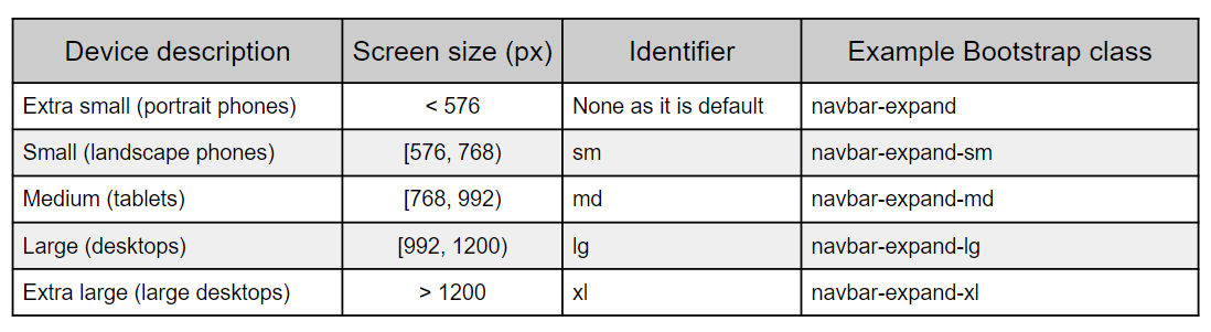
Screen size categorisation Bootstrap uses
Now, what navbar-expand-sm means is that if the screen size is at least 576px, the navigation bar links will be shown in the same line. If you were to update the web page to show the links on the same line, only on screens of at least "Medium" size or 768px, use the navbar-expand-md class.
Collapsing Navigation bar on smaller screens
Now we'll improve our web page to display the toggle icon on screens less than 576px.
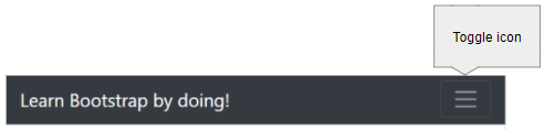
Navigation bar on Extra small screens
TODO -
-
Add the
class="collapse navbar-collapse"to the<div>element withid="collapsibleNavbar". Find out what the collapse and navbar-collapse classes do. What happens when you reduce your web page width? (Reference - 1, 2) -
Add the below
<button>as a child of the<nav>element. What happens upon reducing the web page width now?
<button class="navbar-toggler" type="button" data-toggle="collapse" data-target="#collapsibleNavbar">

<span class="navbar-toggler-icon"></span>

</button>
- Try clicking the toggle icon. Does it expand to display the two links? Why?
The collapse class hides the content of its <div> element (links) and navbar-collapse adds functionality to toggle display of the links when the toggle icon is clicked. You’ll see the links disappear on a smaller screen size on adding these classes.
The span element inside the button you added creates the toggle icon. Based on where you added the button, you’ll see the toggle icon on the left or the right on a smaller screen size. To view it on the right, add it after the <div class="navbar-brand"> element otherwise add it before.
Let’s briefly look at the HTML attributes we set for the button
-
class="navbar-toggler"- sets Bootstrap style to the button and also sets appropriate color based on the navigation bar text color (navbar-dark). -
type="button"- creates a button with no default behaviour when clicked. See other types here -
data-toggle="collapse"anddata-target="#collapsibleNavbar"- to make contents of the<div class="collapse" id="collapsibleNavbar">element collapse to the button. The value of the "data-target" attribute is “#” followed by the id of the<div>element to hide, “collapsibleNavbar” (which is present below the<button>element)
Though we added the required Bootstrap classes to display the toggle icon and hide the links on smaller screen sizes, the toggle icon won’t expand to display the hidden links on clicking. Clicking an element is an action that can’t be recognized using just HTML and CSS but requires JavaScript. You’ll find here in the Bootstrap intro documentation that we’re supposed to add three <script> elements to import JavaScript files required by Bootstrap.
TODO - Add the below elements just before the closing body tag, </body> and after </nav>. What happens when you click the toggle icon now?
<script src="https://code.jquery.com/jquery-3.2.1.slim.min.js" integrity="sha384-KJ3o2DKtIkvYIK3UENzmM7KCkRr/rE9/Qpg6aAZGJwFDMVNA/GpGFF93hXpG5KkN" crossorigin="anonymous"></script>

<script src="https://cdnjs.cloudflare.com/ajax/libs/popper.js/1.12.9/umd/popper.min.js" integrity="sha384-ApNbgh9B+Y1QKtv3Rn7W3mgPxhU9K/ScQsAP7hUibX39j7fakFPskvXusvfa0b4Q" crossorigin="anonymous"></script>

<script src="https://maxcdn.bootstrapcdn.com/bootstrap/4.0.0/js/bootstrap.min.js" integrity="sha384-JZR6Spejh4U02d8jOt6vLEHfe/JQGiRRSQQxSfFWpi1MquVdAyjUar5+76PVCmYl" crossorigin="anonymous"></script>
Clicking on the toggle icon will expand its contents after adding the JavaScript files. Clicking again will hide it, hence the name "toggle".
Simulate web page rendering on Mobile devices
Chrome developer tools provide a feature to simulate how your web page would look like on different screen sizes and popular smartphones. View the milestone demo video at the beginning of this milestone or this reference to understand how to do it. For it to work you’ll have to add the below <meta> tag inside the <head> element of your index.html file.
<meta name="viewport" content="width=device-width, initial-scale=1, shrink-to-fit=no">
Curious Cats
-
How would you always hide the navigation bar links and display the toggle button irrespective of the screen size?
-
Now that you started learning Bootstrap. How would you add a dropdown list named CSS in the navigation bar with two links, Plain CSS and Bootstrap?
-
How would you align links in the navigation bar to the right?
Creating responsive content using Grids
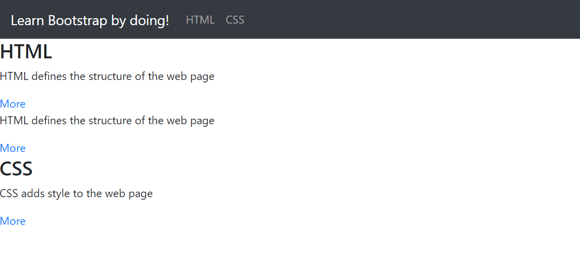
We’ll now add content to our website as cards and make those responsive as well. Each card will have as text, an HTML or CSS fact (something that you know about HTML/CSS). Feel free to improve it as a flash card website!
Watch the below video to get a glimpse of what you’ll build by the end of this milestone.
TODO - Add the below HTML content after closing the </nav> tag and before the <script> tags. (Feel free to replace "HTML defines the structure of the web page" and “CSS adds style to the web page” strings with other HTML/CSS facts that you’ve learnt)
<div id="html-container">

  <h3>HTML</h3>


  <div>

    <div>

      <p>HTML defines the structure of the web page</p>

      <a href="https://www.crio.do">More</a>

    </div>

  </div>

  <div>

    <div>

      <p>HTML defines the structure of the web page</p>

      <a href="https://www.crio.do">More</a>

    </div>

  </div>


</div>


<div id="css-container">

  <h3>CSS</h3>


  <div>

    <div>

      <p>CSS adds style to the web page</p>

      <a href="https://www.crio.do">More</a>

    </div>

  </div>

</div>
The web page will look like this now
Bootstrap Cards
Let’s create a card for each of the HTML/CSS facts.
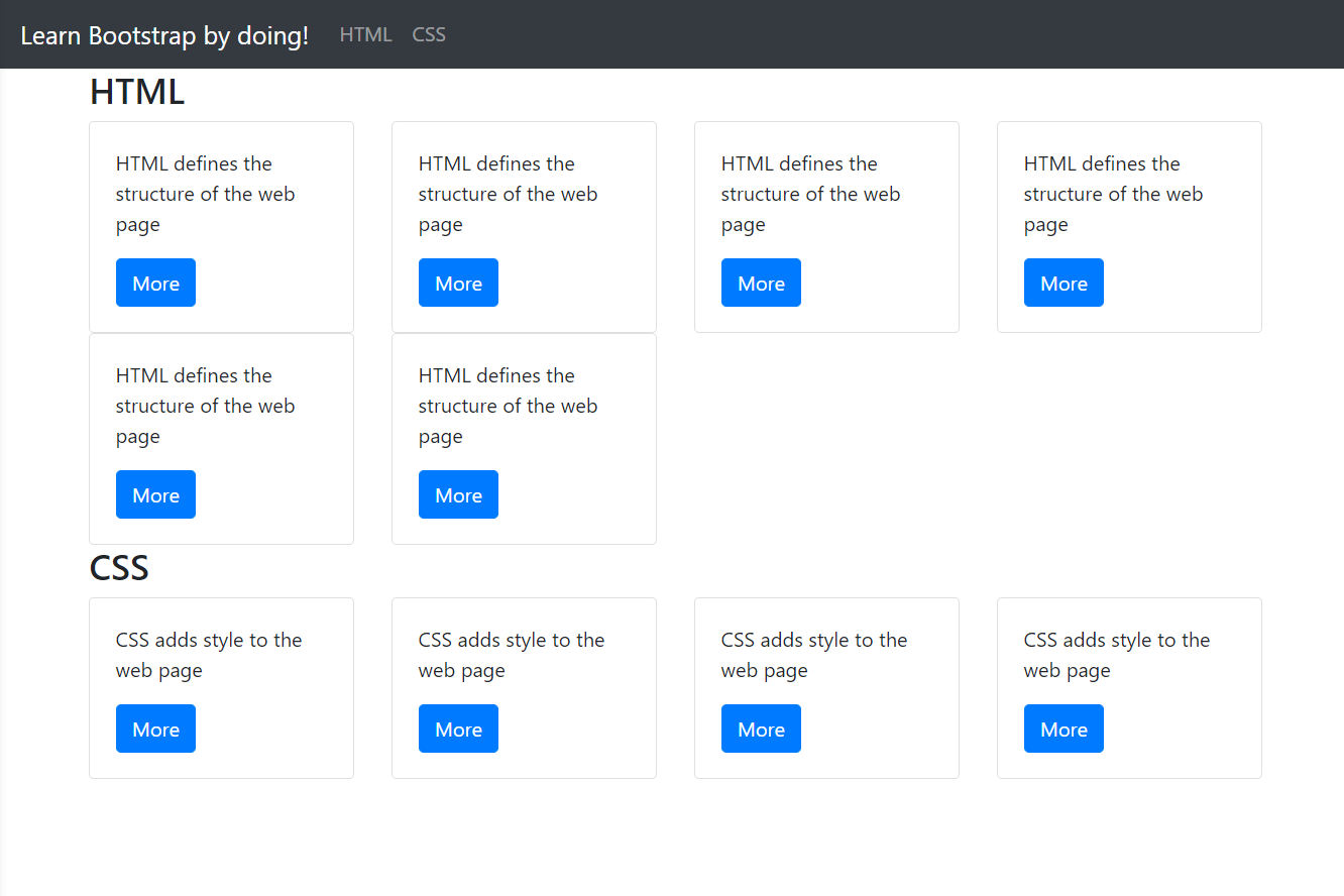
TODO - Use this as a reference to create cards for each of the 3 fact groups given (2 HTML + 1 CSS). Your web page should look like this.
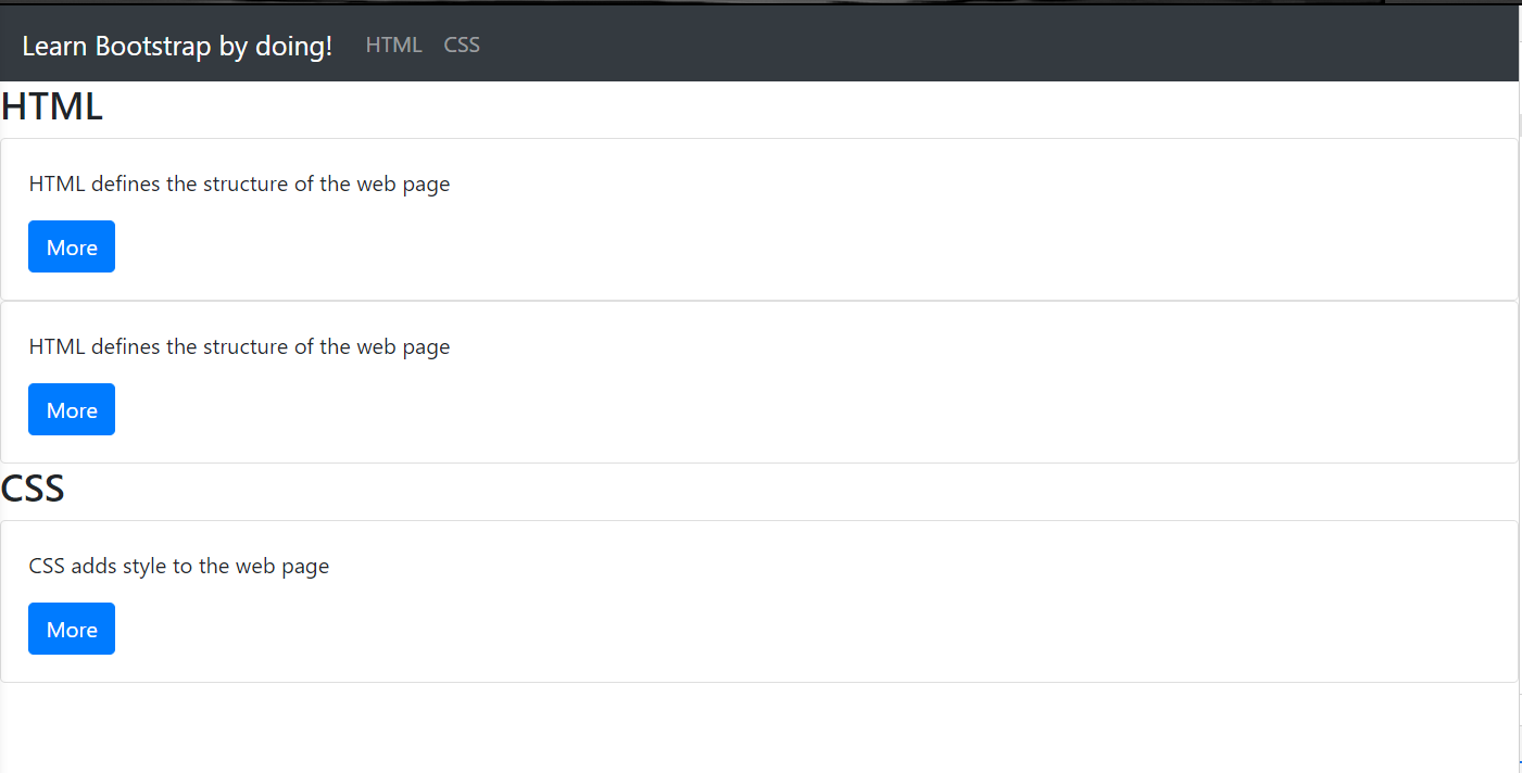
Each of the cards will have a structure like this
<div class="card">

  <div class="card-body">

    <p class="card-text">HTML defines the structure of the web page</p>

    <a href="https://www.crio.do" class="btn btn-primary">More</a>

  </div>

</div>
-
card class is the root class for a card
-
card-body wraps the body of the card. If header or footer is present they’d come outside the card-body
<div> -
card-text applies styles to the text
-
btn sets the hyperlink to look like a button and btn-primary sets the color. Feel free to use other colors like btn-success, btn-secondary similar to alert-success, alert-secondary in Milestone 1.
Bootstrap Grid System
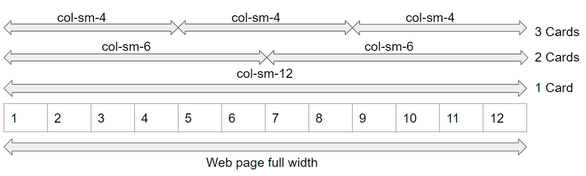
Any card we add will take up the whole of the page’s width now. Let’s use Bootstrap’s Grid system to organize the cards.
"Bootstrap’s grid system uses a series of containers, rows, and columns to layout and align content. It’s built with flexbox and is fully responsive." - Bootstrap Docs
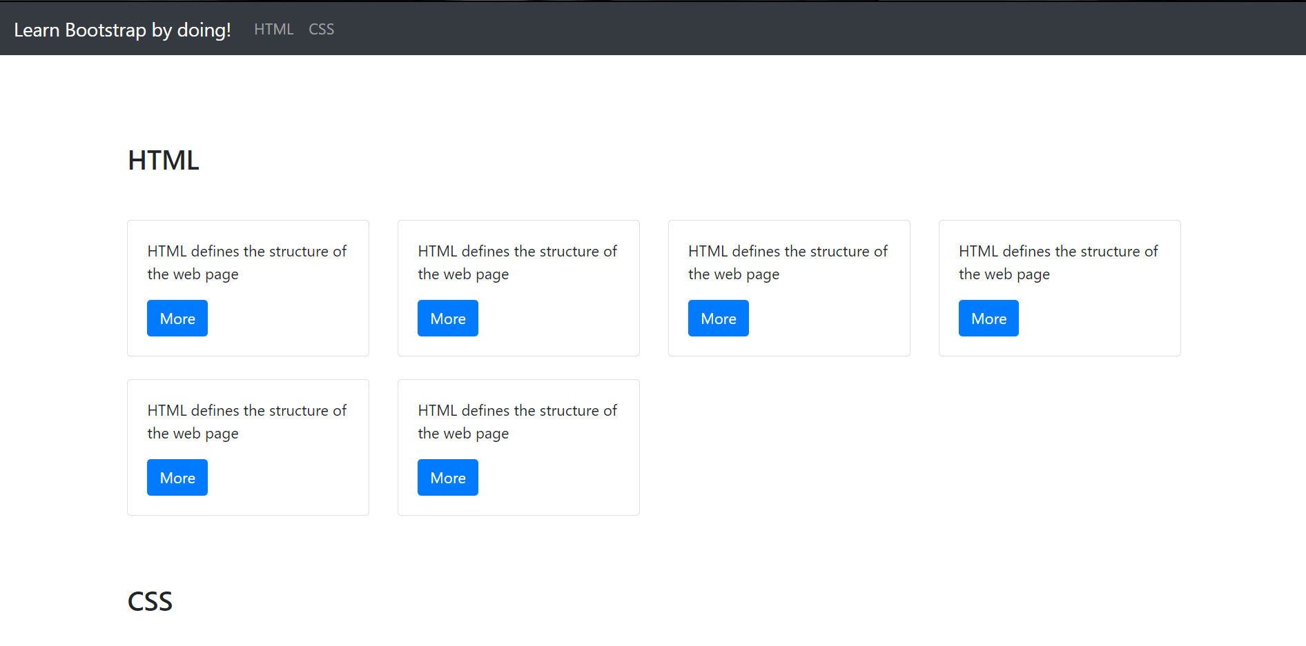
A row of a Bootstrap Grid can be considered to be 12 cells and we can specify the size of the columns in each row as the number of cells. If we add the class, col-sm-12 to one of the columns (or cards in our case), it will take up the whole row (like what we have now in our web page). Using the col-sm-6 class allows for 2 cards in a row, col-sm-4 allows for 3, col-sm-3 allows for 4 and so on.
TODO -
-
Add container class to the
<div>elements with the ids -html-containerandcss-container. -
Use this reference to organize your cards as given below
-
1 card per row on extra small devices
-
2 cards per row on small and large devices
-
4 cards per row on extra large devices
-
-
Copy-paste the appropriate element inside the HTML and CSS containers such that the HTML section has 6 cards and CSS has 4 instead of 2 HTML and 1 CSS cards given to you.
Check if your web page looks like the below screenshot (on full-screen size) and that the number of cards in a row is 1 when screen size is reduced to less than 576px (eg: iPhone X on portrait mode)
Your HTML container <div> would’ve looked like this, upon adding these classes.
<div class="container" id="html-container">

  <h3>HTML</h3>

  <div class="row">

    <div class="col-12 col-sm-6 col-lg-3">

      <div class="card">

        <div class="card-body">

          <p class="card-text">

            HTML defines the structure of the web page

          </p>

          <a href="https://www.crio.do" class="btn btn-primary">More</a>

        </div>

      </div>

    </div>

  </div>

</div>
The <div class="col-12 col-sm-6 col-lg-3"> element inside the <div> with class row can be copy-pasted to add more cards.
-
The row class acts like the flex container and all the cards to be grouped together should go inside a
<div class="row”>. In our case, that would be two<div class=”row”>elements one each for the HTML and CSS sections. -
The variants of the col class (eg: col-12, col-sm-6) can be used to wrap each of the individual cards so as to make them responsive and organize based on the screen size.
-
The col-12 class organizes one card on each row on all devices. This is the default behaviour as well.
-
The col-sm-6 class organizes 2 cards each on a row for devices at least the width of a "Small" device (576px). Here, we override the grouping set by col-12 class for screen sizes other than extra-small.
-
The col-lg-3 class organizes 4 cards each on a row for devices at least the width of a "Large" device (992px). Here, we override the grouping set by col-sm-6 class for large and extra-large screen sizes.
-
-
Keep in mind that these breakpoints (sm, lg etc) are inclusive of larger devices than these. Eg: setting col-lg-3 doesn’t just show 4 cards each on "large" devices but also on “extra large” devices. (if there isn’t a col-xl-{value} class set)
Bootstrap Spacing (Margin and Padding)
Bootstrap provides utility classes to add margin and padding to elements as well.
See here for the naming convention.
-
mt-0 - sets margin on top to 0
-
mx-5 - sets margin on x-axis i.e, both left and right to
size5 which translates to 3rem units (in normal case) -
p-0 - sets padding on all 4 sides to 0
-
pr-md-0 - sets padding on right for at least medium sized devices to 0
TODO -
-
For both the container
<div>elements, add a bottom margin of size 5 -
For both the
<h3>elements, add a top and bottom margin of size 5 -
Use inline styling to add a padding of 100px to top for the HTML
<h3>element -
For the
<div class="col-12 col-sm-6 col-lg-3elements, add a bottom margin of size 4
The CSS cards will also be having similar margin and padding as the HTML cards shown above.
This is how the opening tags would look like for the changed elements
// mb-5 sets margin of size 5 on bottom

<div class="container mb-5" id="html-container">

	// my-5 sets margin of size 5 on top and bottom

	<h3 class="my-5" style="padding-top: 100px">HTML</h3>

		<div class="row">

			// mb-4 sets margin of size 4 on bottom

			<div class="col-12 col-sm-6 col-lg-3 mb-4">
Bonus Tasks (Optional)
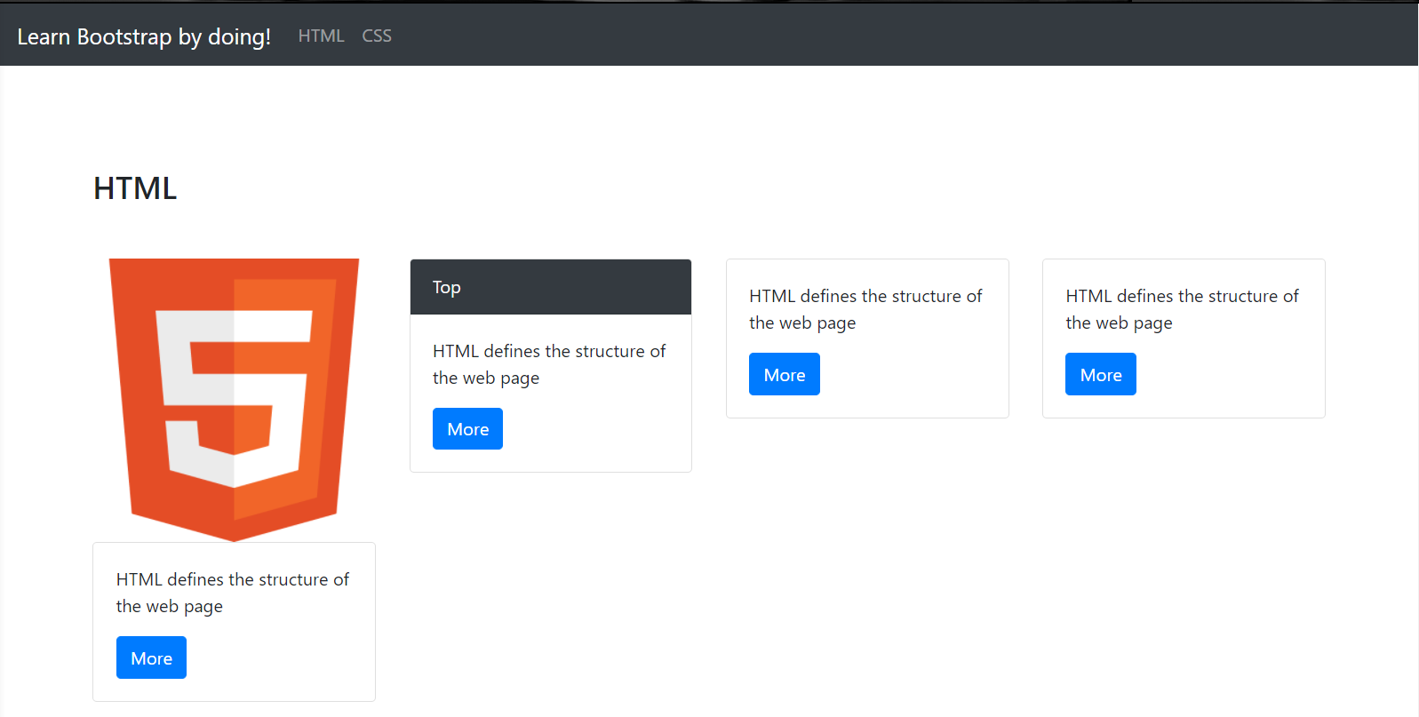
- Add an image to the first HTML card (use this image - https://www.w3.org/html/logo/downloads/HTML5_Badge_512.png) and a header titled, "Top" to the second. The cards should look like this.
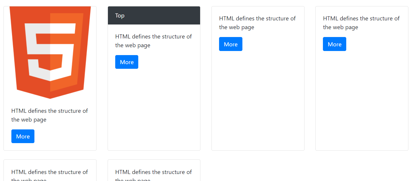
- With the above changes, you’ll find the cards in the first row having different heights. Can you make the cards in a row of the same height no matter if they grow or shrink? (Reference) (Think about right
<div>to add these classes to)
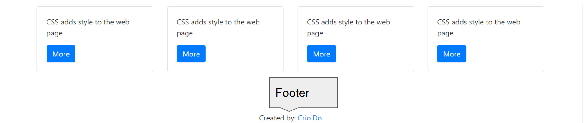
- Add a footer to the web page using Bootstrap classes. (Reference)
-
Set the "href" attribute of the navigation bar links to quick-navigate to the HTML and CSS section. (Use id of the HTML and CSS container
<div>elements - Reference) -
Deploy your web page using Netlify CLI or Ngrok. Open it on your smartphone to view your Bootstrapped web page. (If you are on workspace, while doing
npm install, you don’t need to use the-gflag with it, the command we should consider is:netlify deploy)
Note
Fun fact - you just created a good looking web page writing zero lines of CSS!
Curious Cats
-
Can you make your navigation bar fixed to the top using Bootstrap?
-
Can you make the image that you added for HTML circular using Bootstrap?
Summary
-
Bootstrap is a CSS framework to quickly create beautifully styled responsive web pages.
-
Bootstrap works by using the exposed classes in the HTML code.
-
Creating web page elements like a navigation bar and content cards is easy using Bootstrap
-
Bootstrap provides classes to add color, margin, border and other element properties
-
Bootstrap allows us to define how different elements should look in screens of varying sizes.
-
Find
-
Further Reading
Newfound Superpowers
- Knowledge of the Bootstrap CSS framework
Now you can
-
Utilize the Bootstrap framework to quickly create a responsive and good-looking web page
-
Add responsive navigation bar to your web pages
-
Add responsive content area as cards with varying organisation based on the screen size